Problem
Stakeholders have been trying to infuse income collection language and design across Marketplace to increase revenue. This flow can bring in an additional $500k a month.
Product asked the UX team to add an inline banner to existing pages. Following this suggestion would’ve been a quick way to add a new feature, but it would not have been the best experience.
Solution
The Personal Loans UX Designer and I went back to stakeholders and proposed a modal flow and asked to add UX Research to this project.
As a result, this project was split up into two:
- Milestone 2 (accommodates Product’s initial inline addition)
- Milestone 3 (revamps the flow with a modal experience, and takes UXR findings into account)
The final product!
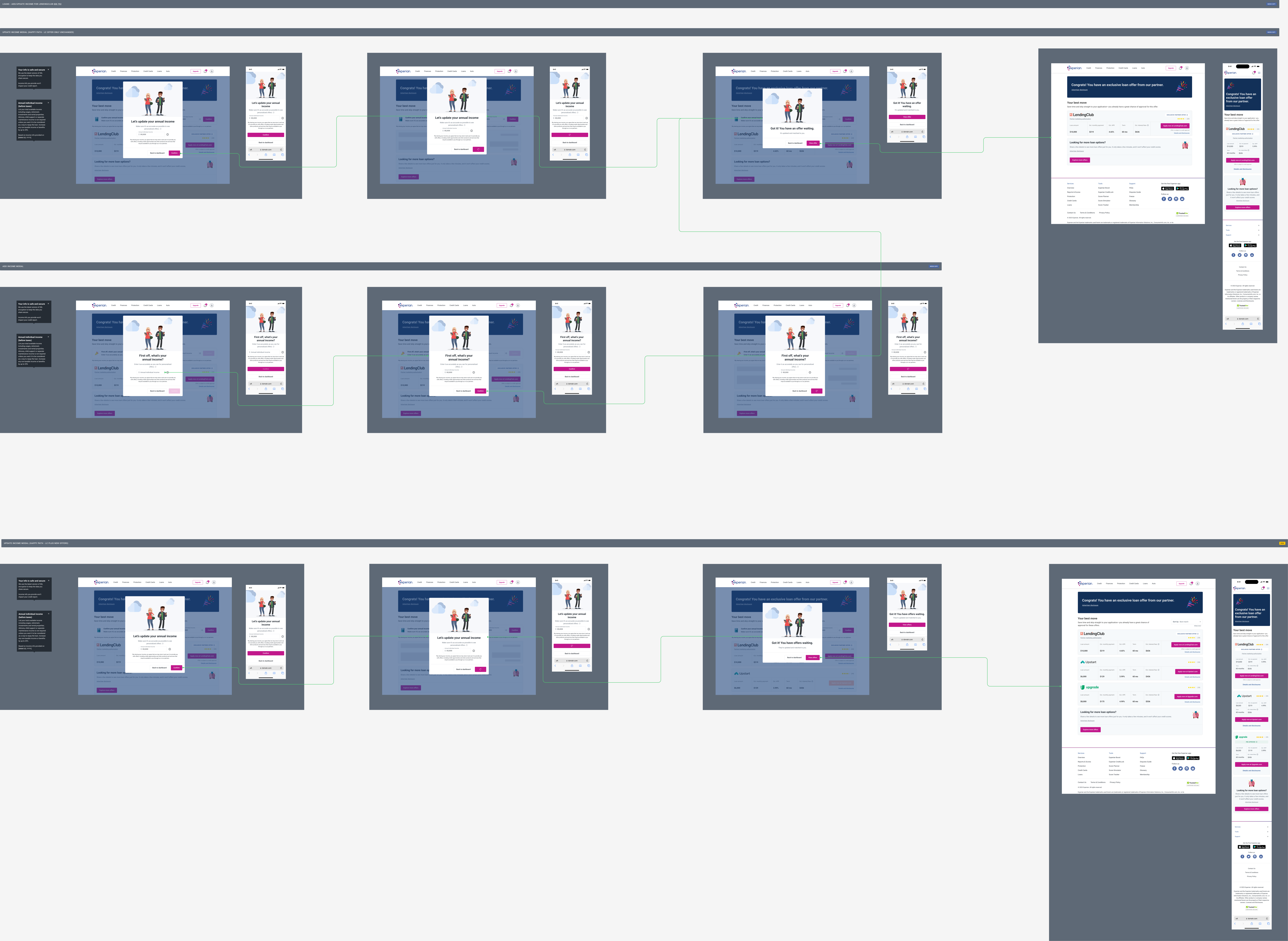
Let’s break it down…
Milestone 2 (pre UXR)
Milestone 2 consists of:
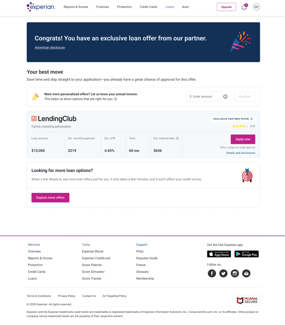
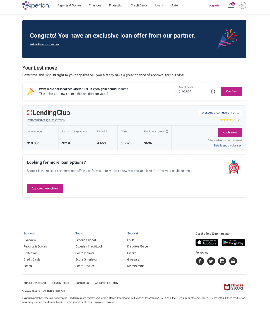
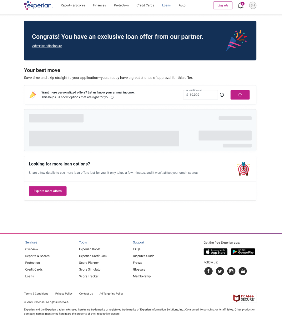
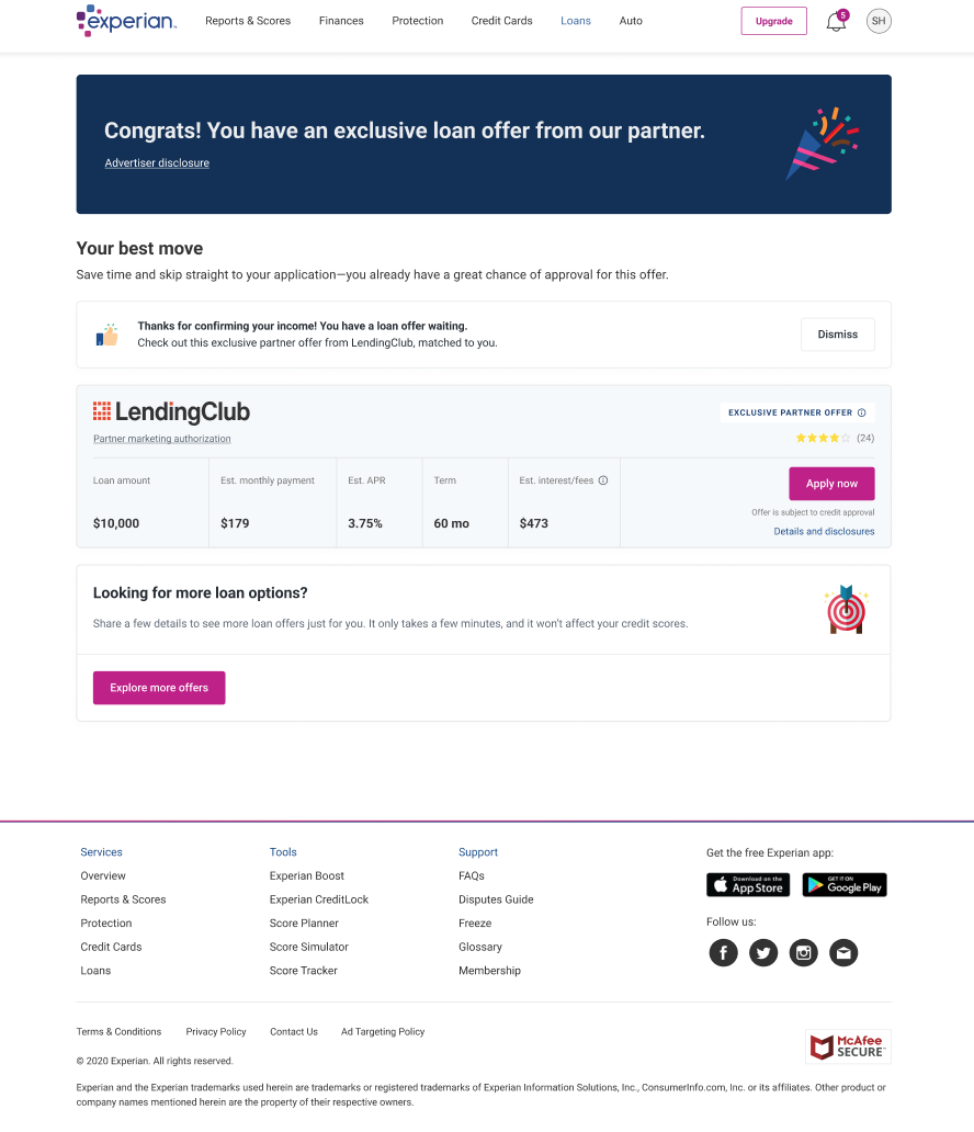
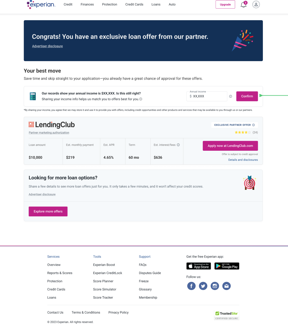
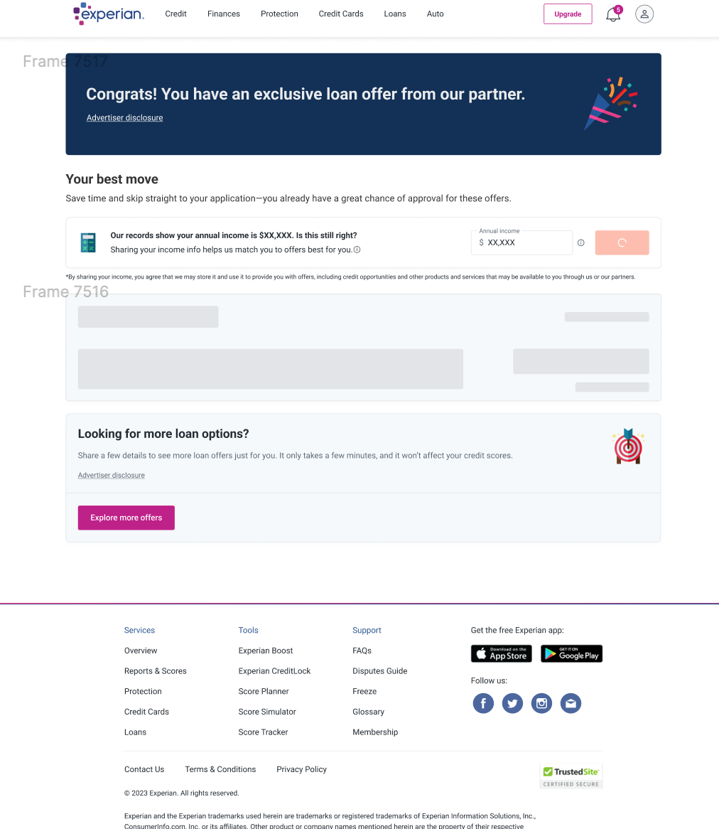
- An inline banner layout
- An add income flow (user has never given any income info)
- An update income flow (user is updating previously shared income info)
Add income flow
The user starts at their account dashboard and taken to this flow after they click or tap on a Personal Loans placement. The inline banner then asks for annual individual income.
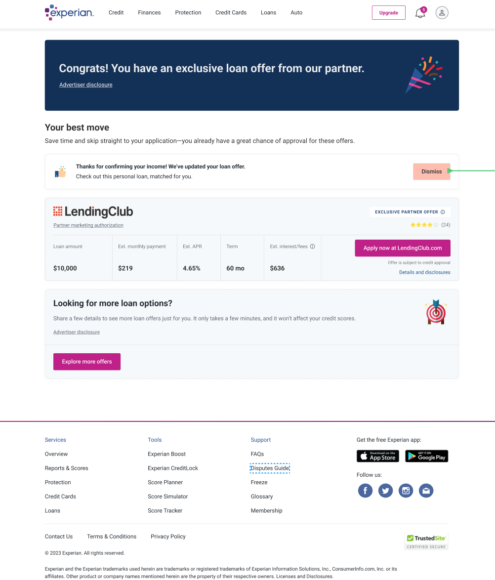
A thank you message pops up at the end, as well as an indication that they’ve been matched to an offer from one of our partners.
Update income flow
The user gets to this flow via one of our dashboard placements, and is asked to update their income info.
We are able to dynamically pull in their last stated income amount, and include it as additional context.
UXR interviews
Our UX Research team used a prototype featuring Milestone 2’s design and copy. Insights were added to Milestone 3.
- Sessions lasted 30 minutes
- 7 users viewed a Figma prototype on their computers
- Two variations of the prototype were shown:
- Happy path – For users who indicated that they make $60,000+
- Unhappy path – For users who indicated that they make less than $60,000
Findings
We learned that:
- Users expected this to be a flow where they could edit the income amount they provided
- Users were unsure of what type of income to include
Milestone 3
This flow consists of:
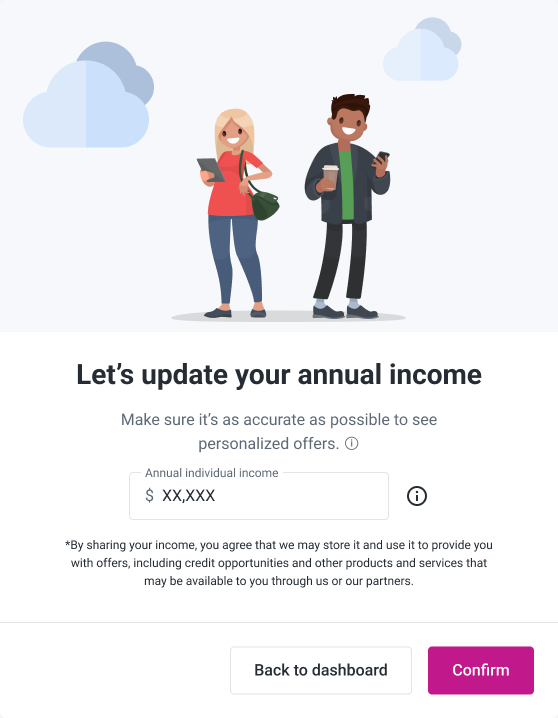
- A modal design
- UXR updates
- An add income flow
- An update income flow
What content changes were made?
The biggest changes I made to the text were to the subcopy and the income field.
- The sub copy was edited to include information about entering income as accurately as possible
- The income collection field was renamed to say “annual individual income” to add clarity
Challenges and lessons
As with any project, there were some bumps along the way. But there were some incredible lessons learned that ultimately helped me grow as a UX Writer.
Some challenges include:
- Pressure to deliver early
- Pivot from initial product roadmap
- Legal and compliance constraints
- Portions of the project were developed early
Some lessons learned include:
- The power of UX collaboration! This was such a collective effort across design, content, and research! We all came together and iterated based on user feedback to enhance the user experience.
- How to advocate for content in a large, ever-evolving group. There were a lot of people involved in this project, so I had to be vocal about the content needs across teams and had to make sure nothing got lost as we went from M2 to M3.
